Introduction
Creating award certificates that truly resonate requires more than just filling in a template; it demands a thoughtful approach to design that elevates the recognition experience. By mastering key design principles, selecting appropriate templates, and incorporating personalized elements, organizations can craft certificates that not only look professional but also convey genuine appreciation.
However, with so many options available, how can one ensure that their award certificates stand out and leave a lasting impact? This is where the value of quality awards comes into play. Research shows that well-designed awards can significantly enhance the recognition experience, making recipients feel valued and celebrated.
This article delves into essential practices for designing impactful awards that celebrate achievements in a meaningful way. By understanding these practices, you can transform your award certificates into powerful symbols of recognition that resonate with recipients and elevate your events.
Understand Key Design Principles for Certificates
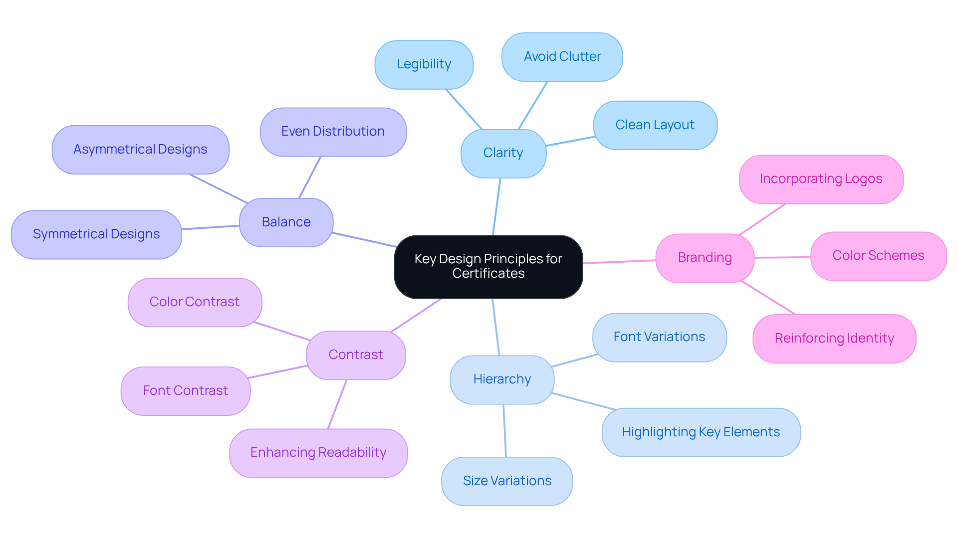
Creating impactful requires a solid grasp of that can elevate the .
- Clarity is paramount. The text must be legible, and the layout should be clean. Avoid cluttering the certificate with excessive graphics or text. As Paul Rand wisely noted, "Simplicity is not the goal. It is the by-product of a good idea and modest expectations." This underscores the , ensuring that the message shines through without distractions.
- Hierarchy plays a crucial role in guiding the viewer's attention. By utilizing size and font variations, you can create a that highlights the most significant elements, such as the recipient's name and the title of the recognition. This method effectively conveys the , making it stand out.
- Balance is essential for a polished appearance. Achieving a balanced layout involves distributing visual elements evenly across the document. Whether through symmetrical or asymmetrical designs, balance contributes to a professional look that enhances the overall impact of the certificate.
- Contrast is another vital principle. Employing contrasting colors and fonts can make important information pop. For instance, a dark font on a light background significantly enhances readability. Research shows that removing 25% of content can strengthen the message, reinforcing the principle of clarity and ensuring that the essential information is communicated effectively.
- Branding should not be overlooked. elements, such as logos and color schemes, reinforces identity and credibility. This customization not only aligns the document with the organization's values but also enhances its overall significance.
By applying these principles, designers can craft that not only look professional but also effectively convey the importance of the recognition. This ensures that recipients feel valued and acknowledged, ultimately enhancing the . Are you ready to elevate your award certificates to the next level?

Choose Appropriate Templates and Styles
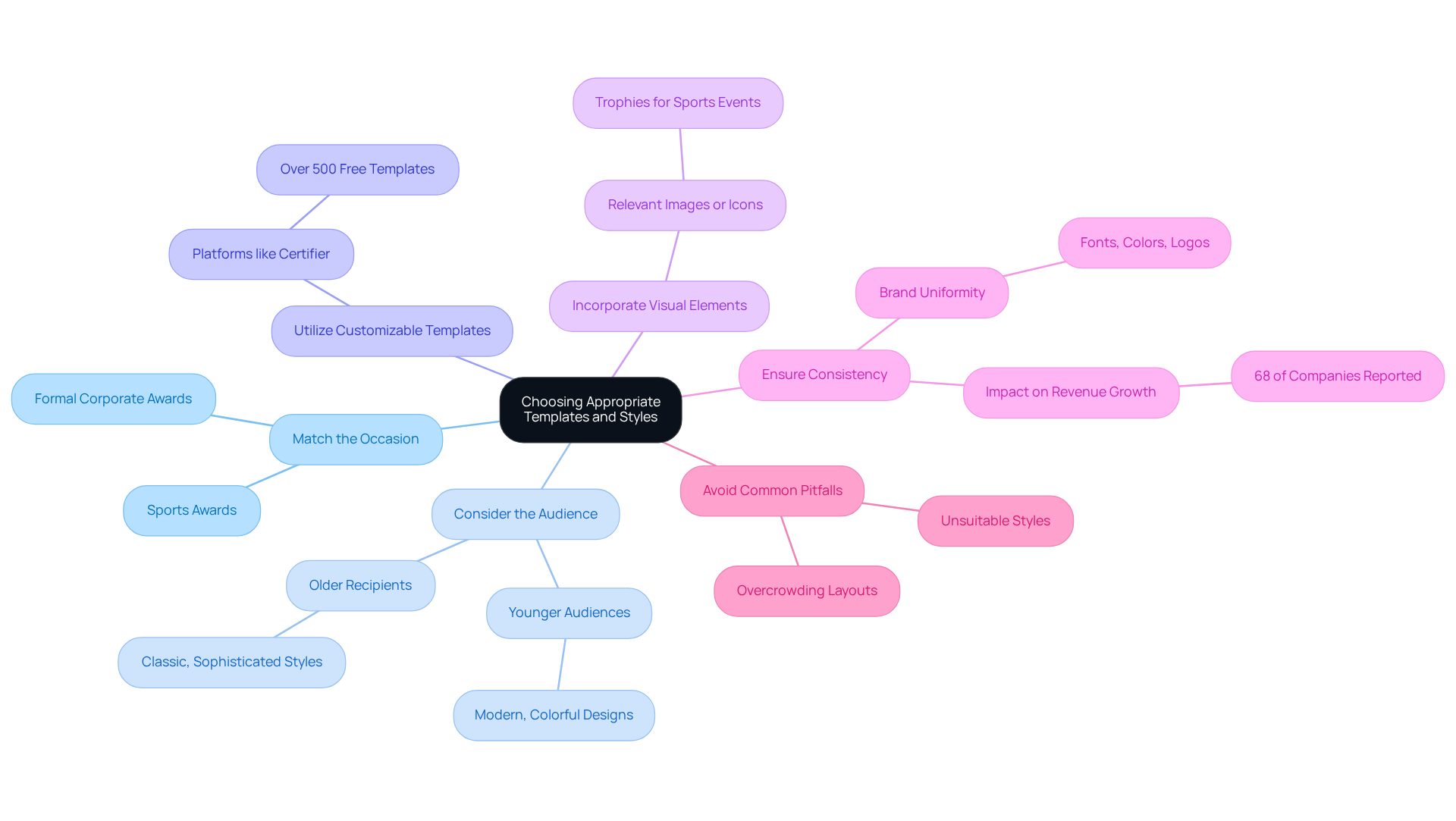
Choosing the right template and style for an is essential for maximizing its impact. To achieve this, consider the following :
- Match the Occasion: Select a template that reflects the nature of the event. For formal corporate awards, an ideal choice is a . In contrast, sports awards may benefit from that capture the excitement of the occasion.
- Consider the Audience: Tailor the layout to the preferences of the recipients. Younger audiences often appreciate , while older recipients might lean towards classic and sophisticated styles.
- Utilize : Take advantage of platforms like Certifier, which offers access to over 500 free document templates. This allows for personalization while ensuring a professional appearance. Such flexibility in the can significantly enhance the program's appeal and relevance.
- Incorporate : Choose templates that permit the addition of relevant images or icons that symbolize the recognition's purpose. For instance, trophies or medals for sports events can enhance the document's significance.
- Ensure Consistency: Maintain brand uniformity by using similar fonts, colors, and logos across all documents. Research shows that 68% of companies reported that contributed to a 10-20% increase in revenue growth. This not only strengthens the organization's identity but also elevates the overall aesthetic and professionalism of the honors.
- Avoid Common Pitfalls: Be vigilant about , such as overcrowding the layout or employing unsuitable styles that do not align with the event's tone.
By thoughtfully selecting formats and , organizations can create documents that are not only visually appealing but also resonate deeply with individuals, ultimately enhancing the significance of the honors.

Incorporate Personalization for Greater Impact
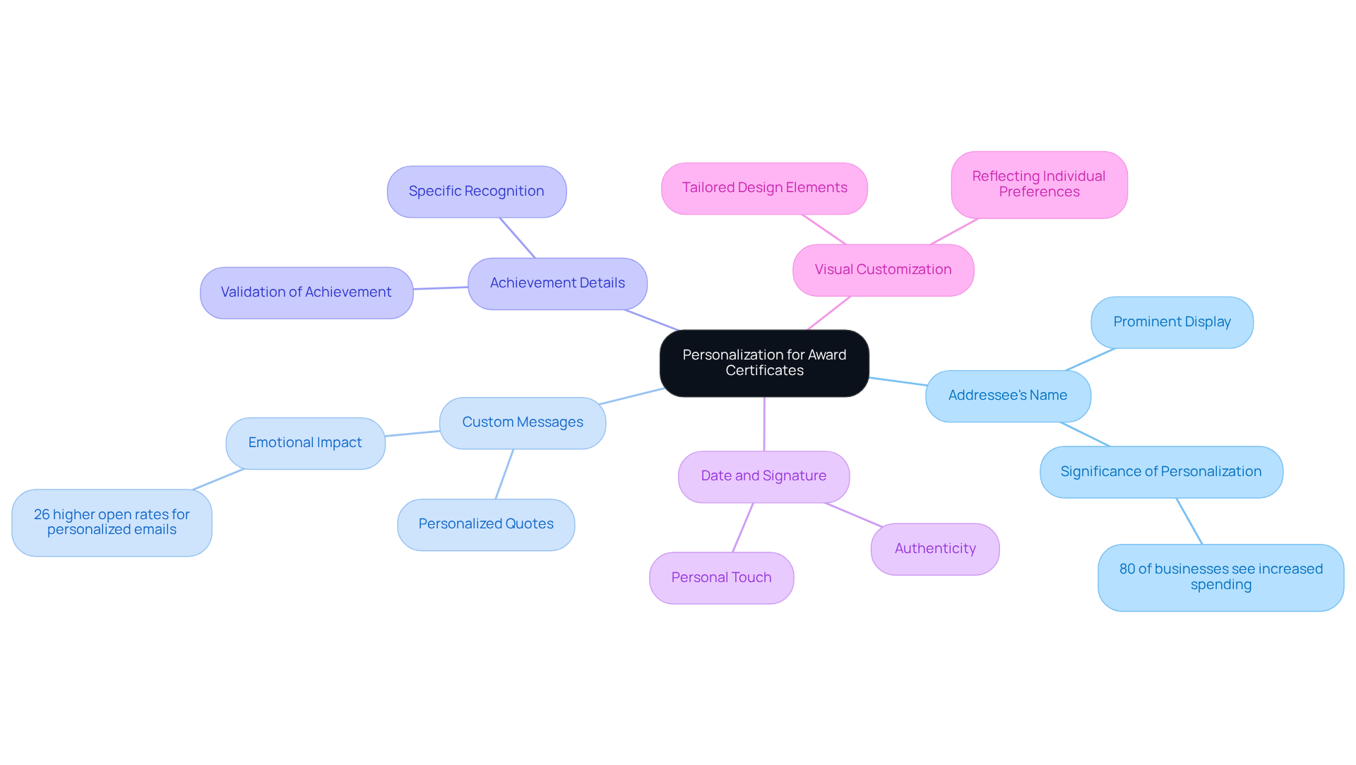
is essential for creating an that leaves a lasting impression. Here are effective strategies to enhance :
- Addressee's Name: Prominently feature the addressee's full name on the certificate. This simple yet powerful addition elevates the award's significance, making it feel uniquely tailored to the individual. Research shows that . This underscores the importance of including the individual's name.
- : Incorporate a or quote that reflects the recipient's achievement or embodies the organization's values. Such messages deepen the emotional impact of the recognition, fostering a stronger connection. For example, , illustrating how tailored communication enhances engagement.
- Achievement Details: Clearly articulate the being recognized, whether it's 'Employee of the Month' or 'First Place in the Annual Competition.' This clarity not only validates the recognition but also enhances its value.
- Date and Signature: Include the date of recognition and a signature from an appropriate authority, such as a manager or event organizer. This adds authenticity and a personal touch, reinforcing its significance.
- Visual Customization: Tailor , such as colors or motifs, to reflect the individual's preferences or the award's context. This visual can make the document even more special.
As Emiliana Simon-Thomas notes, . By implementing these strategies, organizations can create s that resonate deeply with recipients, reinforcing their sense of achievement and belonging.

Select Quality Materials and Printing Techniques
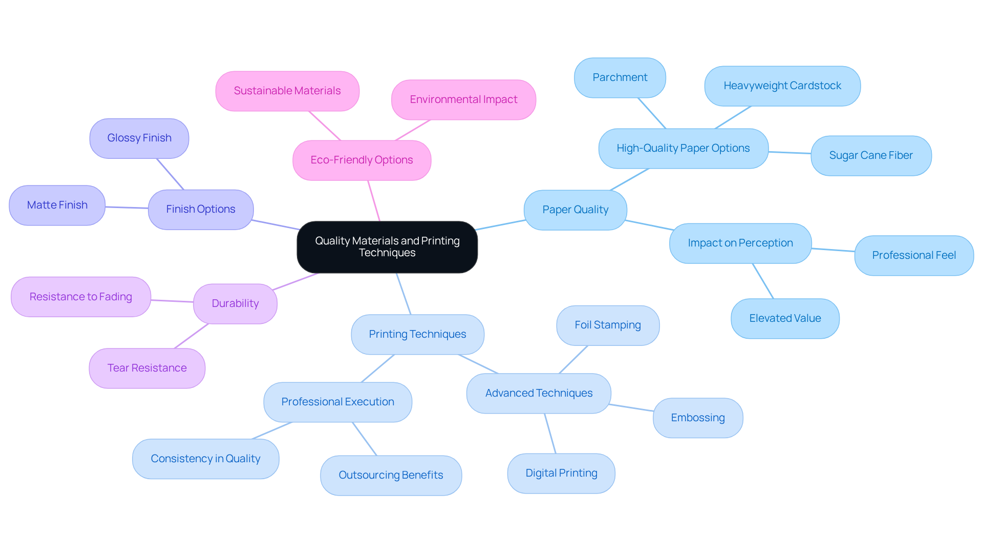
The selection of materials and printing methods plays a crucial role in determining the overall quality of recognition documents. To create that truly stand out, consider these essential practices:
- Paper Quality: Opt for , such as parchment or heavyweight cardstock. This choice not only enhances the document's professional feel but also elevates its . The texture and weight of the paper can significantly influence how the award is received.
- Printing Techniques: Explore like embossing, foil stamping, or digital printing. These methods can dramatically enhance the visual appeal of the certificate, adding depth and sophistication to its design.
- Finish Options: Decide between based on the desired aesthetic. Matte finishes offer a classic touch, while glossy finishes can make colors pop, enhancing the overall visual impact.
- : It's vital to ensure that the materials used are and display. Certificates should resist fading and tearing, particularly if they are intended for framing or public display.
- Eco-Friendly Options: Consider to resonate with environmentally conscious recipients. This approach not only enhances your organization's reputation but also aligns with contemporary values.
By carefully selecting quality materials and employing effective printing techniques, organizations can create award certificate designs that not only impress but also endure the test of time. Don't underestimate the power of a ; it reflects the value you place on achievement.

Conclusion
Creating impactful award certificates requires a deep understanding of design principles, template selection, personalization, and material quality. By emphasizing clarity, hierarchy, balance, contrast, and branding, designers can produce certificates that not only exude professionalism but also convey the significance of the recognition. The right choice of templates and styles, tailored to the occasion and audience, enhances the emotional connection recipients feel towards their awards.
Incorporating personalization strategies - such as featuring the recipient's name, adding custom messages, and including achievement details - can significantly elevate the perceived value of the certificate. Furthermore, selecting high-quality materials and advanced printing techniques ensures that these awards are not only visually appealing but also durable and memorable. Each of these elements plays a crucial role in crafting certificates that resonate with recipients and reflect the true value of their achievements.
Ultimately, the design of award certificates transcends mere aesthetics; it honors accomplishments in a way that feels meaningful and significant. By implementing these best practices, organizations can elevate their recognition programs, ensuring that every award certificate serves as a lasting symbol of achievement. Embrace these strategies to create certificates that genuinely celebrate excellence and foster a culture of recognition.
Frequently Asked Questions
What are the key design principles for creating impactful award certificates?
The key design principles include clarity, hierarchy, balance, contrast, and branding. These principles help enhance the recognition experience and ensure the certificates are visually appealing and effective.
Why is clarity important in certificate design?
Clarity is crucial because it ensures that the text is legible and the layout is clean. A clear design allows the message to shine through without distractions, making the recognition more impactful.
How does hierarchy influence the design of a certificate?
Hierarchy guides the viewer's attention by utilizing size and font variations to highlight significant elements, such as the recipient's name and the title of the award. This method emphasizes the importance of the recognition.
What role does balance play in certificate design?
Balance contributes to a polished appearance by distributing visual elements evenly across the document. Whether through symmetrical or asymmetrical designs, balance enhances the professional look of the certificate.
How can contrast improve the effectiveness of a certificate?
Contrast makes important information stand out by using differing colors and fonts, which enhances readability. For example, a dark font on a light background can significantly improve clarity and focus on essential details.
Why is branding important in certificate design?
Branding reinforces organizational identity and credibility by incorporating elements like logos and color schemes. This customization aligns the certificate with the organization's values and enhances its significance.
What is the overall goal of applying these design principles to award certificates?
The goal is to create award certificate designs that look professional and effectively convey the importance of the recognition, ensuring that recipients feel valued and acknowledged.
List of Sources
- Understand Key Design Principles for Certificates
- 22 famous graphic design quotes (https://99designs.com/blog/creative-inspiration/10-famous-design-quotes)
- 40 Graphic Design Quotes to Draw Inspiration From (https://snappa.com/blog/graphic-design-quotes)
- realthread.com (https://realthread.com/blog/51-design-and-creativity-quotes-guaranteed-to-inspire)
- Inspiring Graphic Design Quotes | Hivo Blog (https://hivo.co/blog/design-wisdom-inspiring-graphic-design-quotes)
- 7 Principles of Design Every Beginner Should Master (https://piktochart.com/blog/principles-of-design)
- Choose Appropriate Templates and Styles
- Branding Joe: Here’s a Quick Way to Create Certificate (https://dochipo.com/how-to-create-certificate)
- madebyshape.co.uk (https://madebyshape.co.uk/web-design-blog/statistics-facts-and-figures-about-the-power-of-branding-for-business)
- Must-Know Branding Statistics for 2026 to Boost Recognition (https://designrush.com/agency/logo-branding/trends/branding-statistics)
- 8 Steps To Effective Certificate Design | Certifier (https://certifier.io/blog/8-steps-to-effective-certificate-design)
- 6 Steps To Effective Certificate Design (https://elearningindustry.com/6-steps-effective-certificate-design)
- Incorporate Personalization for Greater Impact
- mckinsey.com (https://mckinsey.com/capabilities/growth-marketing-and-sales/our-insights/the-value-of-getting-personalization-right-or-wrong-is-multiplying)
- Personalization Statistics 2025: 97+ Stats & Insights [Expert Analysis] - Marketing LTB (https://marketingltb.com/blog/statistics/personalization-statistics)
- The Top 50 Quotes about Recognition and Appreciation (https://rickconlow.com/the-top-50-quotes-about-recognition-and-appreciation)
- 50 Stats Showing The Power Of Personalization (https://forbes.com/sites/blakemorgan/2020/02/18/50-stats-showing-the-power-of-personalization)
- workhuman.com (https://workhuman.com/blog/recognition-quotes-about-employee-value)
- Select Quality Materials and Printing Techniques
- The secrets of high-quality printing: What sets it apart? (https://khangthanh.com/en/Other-news/The-secrets-of-high-quality-printing-what-sets-it-apart-2911.html)
- Printing Paper for Certificates: What Works Best for Schools & Businesses | TheRoyalStore (https://theroyalstore.com/blog/printing-paper-for-certificates-what-works-best-for-schools-businesses?srsltid=AfmBOooNg5X7b54fMmPoQrIWDqwX6U_aIHnExDGaN5Thbc_0YQqsJ02E)
- How Certificate Printing Services Can Make Your Awards Look Premium? | Digital Printing in Bangalore (https://kapricornprints.com/blog/how-certificate-printing-services-can-make-your-awards-look-premium)
- 15 Quotes on the Importance of Paper - Double A Paper Supplier (https://us.doubleapaper.com/home/quotes-importance-paper)


